Dialogs
Saucebase provides a promise-based useDialog composable that lets any component or module show a confirmation dialog and await the user's response — without managing local state or rendering a <Dialog> inline.
How It Works
- A singleton
DynamicDialogcomponent (resources/js/components/DynamicDialog.vue) is mounted once inApp.vue— it is an internal implementation detail; useuseDialog()instead of referencing it directly useDialog().confirm(options)opens it and returns aPromise<boolean>true= confirmed,false= cancelled- Built on shadcn-vue
AlertDialog(role="alertdialog") — clicking outside does not dismiss it, which prevents accidental dismissal of destructive confirmations
Basic Usage
import { useDialog } from '@/composables/useDialog';

const { confirm } = useDialog();

if (await confirm({ title: 'Delete item?' })) {
    // user confirmed
}
Destructive Variant
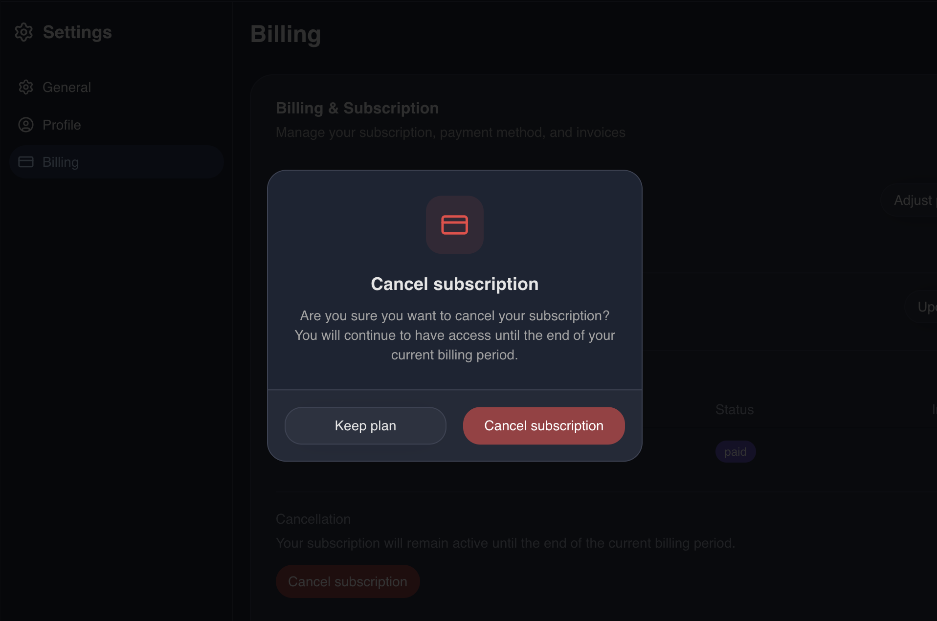
Pass variant: 'destructive' to style the confirm button in red — use this for irreversible actions like deletion or logout. Optionally pass an icon (any Vue component, typically Lucide) to render it above the title in a coloured rounded square.
import { Trash2 } from 'lucide-vue-next';

const { confirm } = useDialog();

if (await confirm({
    title: 'Delete item?',
    description: 'This action cannot be undone.',
    confirmLabel: 'Delete',
    cancelLabel: 'Cancel',
    variant: 'destructive',
    icon: Trash2,
})) {
    // user confirmed
}
API Reference
useDialog()
Returns:
| Property | Type | Description |
|---|---|---|
confirm | (opts: ConfirmOptions) => Promise<boolean> | Opens the dialog, resolves on close |
ConfirmOptions
| Property | Type | Default | Description |
|---|---|---|---|
title | string | — | Dialog heading (required) |
description | string | — | Optional body text |
confirmLabel | string | 'Confirm' | Confirm button label |
cancelLabel | string | 'Cancel' | Cancel button label |
variant | 'default' | 'destructive' | 'default' | Confirm button variant |
icon | Component | — | Optional Lucide (or any Vue) icon rendered alongside the title |
align | 'center' | 'left' | 'center' | center: icon above title, everything centred. left: icon inline-left of title/description |
Using in Modules
The composable is part of the core (@/composables/useDialog), so any module can import it directly — no registration needed.
modules/YourModule/resources/js/app.ts
import { useDialog } from '@/composables/useDialog';
import { router } from '@inertiajs/vue3';

const { confirm } = useDialog();

if (await confirm({ title: 'Cancel subscription?', variant: 'destructive' })) {
    router.delete(route('billing.subscription.cancel'));
}
Test IDs
The DynamicDialog renders with data-testid attributes for E2E testing:
| Element | data-testid |
|---|---|
| Dialog wrapper | confirm-dialog |
| Confirm button | confirm-dialog-confirm |
| Cancel button | confirm-dialog-cancel |
Playwright example
await page.getByRole('menuitem', { name: /delete/i }).click();

const dialog = page.getByTestId('confirm-dialog');
await expect(dialog).toBeVisible();

await page.getByTestId('confirm-dialog-confirm').click();
await expect(dialog).not.toBeVisible();
What's Next?
- Navigation — Register action-based nav items that trigger dialogs
- Modules — Creating and managing modules